Creative Services Ads Review to Boost ROI


Looking to improve your ads to increase engagement and performance? The 6sense Creative Services team can help!
Share 1-2 ad creatives in this discussion thread and we'll provide actionable insights to optimize elements like copy, visuals, and CTAs. We can even draft you copy ideas and, where relevant, show you new designs and imagery to try.
Sometimes simple changes can go a long way. We'd love to help you build ads that drive results.
*If you're looking for more extensive consultative support or want our in-house experts to design, build, and launch ads for you, reach out to your CSM or email creativeservices@6sense.com.
Comments
-
@Michelle F @Carole Groombridge @KristaB - 👆️ if you're working on anything you want help with
1 -
Plan to run these soon- love feedback on improvements. Thanks!
3 -
Thanks for sharing @Erica Franck! Will get you feedback by EOD :)
1 -
@Sergio Lee - who can I forward this to?
0 -
Hi @Nikki Gloudeman - Our team has been leaning into video ads lately. I know we probably should get some more static banner creative done as well, but we'd love to hear your creative team's thoughts on these:
- We're currently targeting our awareness stage audiences with this ad: https://drive.google.com/file/d/1JrtjuuZoIJTTYnQDscWHrXhJSAKtbAmf/view?usp=sharing
- early consideration audiences with this ad (we 1:1 and 9:16 variations for social as well): https://drive.google.com/file/d/1da1olHYqQozEcV5_6kmgawVw7X9zHkyz/view
- We've also developed this case study video and will be creating shorter "teaser" versions to target our decision and purchase stage audiences and drive them to a landing page with a full version of this video: https://app.frame.io/reviews/5120c55f-a6fe-4cc9-aa5d-b033bdff5f1c/0b28e8f7-f582-4d66-b65e-7c327a3ac47d?version=22666481-ca06-40f8-bf79-180f00ea5f67
I know we aren't exactly achieving a consistent look / feel / message between these three phases of creative so any ideas on how we could better achieve that would be great. We're a B2C marketing agency and our target audiences are in the home services space. Thanks!
3 -
Thanks for sharing these, @echilds! We'll get you feedback by tomorrow.
1 -
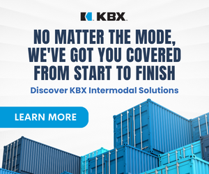
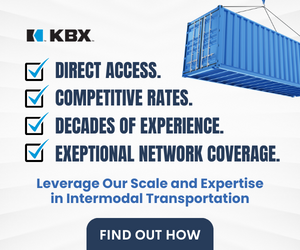
@Erica Franck Thanks so much for sending these ads along! Our team really likes them overall—they’re engaging and clean. Here's some feedback we have to optimize them even further:
Copy
- On the first ad, the copy is snappy, but could go further to express the value prop. “We’ve got you covered” is a bit vague—in what way? A tweak I could see helping: Change the messaging to something like, “No matter the mode, we’ve got you covered with exceptional network coverage.” (I’m presuming this messaging can be similar to ad #2, but of course this can be tweaked if these are ads for different products/services.) Target audience should also factor in here—being specific about what you offer will be particularly important if this is targeting a top-of-funnel audience.
- On the second ad, the checkbox design is compelling, but there’s too much copy to easily take in. We recommend 10 words max for heading copy and 15 words max for heading + subheading copy combined (and 10 words max for all leaderboards). An easy change would be streamlining the four checkboxes to two checkboxes (for instance, by just including “Exceptional Network Coverage” and “Competitive Rates,” two of the strongest for showing value). This will also allow you to increase the font on the subheading, which would help make this actionable copy stand out more.
- We often find that it’s better to orient the copy toward what the prospect will get from your product/service — so a second-person v. first-person framing. To this end, something like “Evolve Your Freight Process with Intermodal Transportation” might be stronger than “Leverage Our Scale and Expertise in Intermodal Transportation.”
- Small typo: It should be “Exceptional,” not “Exeptional.”
Design
- We typically find that images of people (ideally staring directly at the camera, with a relaxed and friendly expression) work best—but these shipping container images are really strong. They’re versatile, while also instantly adding context. Of the two, the image in the second ad, with the shipping container swinging overhead, is the most compelling; playing with scale and camera positioning is eye-catching. For this reason, it may be worth pairing this visual with the other ad copy, perhaps in an A/B test (see below).
- Avoid condensed fonts as much as possible, since they’re a little more difficult for the reader to absorb at a glance.
- Consider A/B testing a more traditional CTA button. These CTAs, which are bleeding off the page, are fun, but we haven’t seen a lot of success with this approach. They’re worth trying, but would be good to test against a standard button to see what works.
Campaign set-up
- Make sure you build the optimal ad sizes for reach and performance. We recommend 300x250, 728x90, 320x50 (if you’re running on mobile), and 300x600. And the 300x600 can typically be removed without impacting reach if you want to streamline further.
- A/B testing is advised to drive up CTR and find what works. Ideally, this is done by building two distinct ad groups with one isolated creative variable at launch (eg same design, different copy). Then once both ad groups have reached 50K impressions, deactivate the lowest-CTR ad group and iterate on the highest-CTR ad group (eg by taking the winning copy and pairing it with a new visual approach). If these are ads for the same campaign, you could follow the process above. Since the copy and design are distinct in both, it may be a little harder to ID what’s driving a difference in performance, but you can still take the winning ad and test a new spin on it for an iterative round.
Hope this helps! Let us know if you have any other questions.
4 -
@echilds Thanks again for sharing these videos! They're strong overall; great job including engaging copy (important since video ads often appear without sound) and maintaining visual interest throughout.
Our main feedback is to be mindful of length. We recommend that video ads not exceed 30 seconds in length—and even then, the most important information should ideally come within the first 15 seconds. So these would benefit from frontloading the value prop and making a few cuts.
For the Trane video, consider making some cuts up top—it takes about 7 seconds (a decent chunk of time for a video ad) for the copy to come in emphasizing what you offer. Especially considering this is for an Awareness audience, it’d be better to get to your value prop quickly.
The Market Fit Analysis video does an excellent job of quickly and explicitly conveying your value. Just keep in mind that the copy should flow naturally when read without sound; “Team of digital marketing and mass media experts will evaluate your business...” for instance, reads a bit awkwardly without the talk track.
And then the final frame of both ads would optimally serve as de facto, clickable banner ads—so ideally including the logo, actionable copy, and a call to action. The Market Fit Analysis ad does the best of the two in inviting action at the end.
In terms of a consistent look/feel, especially if these will target a similar audience but at different buying stages, a bit more consistency would indeed be helpful. But you don’t necessarily need to revamp the videos to achieve this; it could be as simple as having a similar visual on the first and final frames of the ads for a connective thread.
Finally, we love the idea of case study teasers! Keep these short as well and when thinking about what to pull, focus on tangible value. Eg the snippet of Chris Swere saying, “After collaborating with Metz, HVAC Coach Pro and Mediagistic, we’ve seen an overall increase in performance, specifically within their conversions and their brand searches. From a conversion perspective, specifically with Google Ads, we’ve seen over an 80% increase in conversions. And from a brand perspective, we’re seeing an increase in overall brand searches, which has increased by over 50% year over year” — would be great to include in a short video. Especially since these will target a decision/purchase audience, driving home the specific, tangible results prospects can anticipate from working with you will be key to facilitating conversions.
Hope this helps — let us know if you have any questions!
2 -
Thank you so much for the feedback! This is very helpful!
1 -
Hi team
Would love feedback on this ad.
It is getting attention BUT the lead quality is crap.
Thoughts appreciated.
Mich @ Coveo
0 -
Hi @Nikki Gloudeman, we've been running the attached ads to our segments that are built based on research (keywords and topics) and then broken out by buying stage (awareness/consideration/decision/purchase). We are seeing very low CTRs and account CTRs, as well as low VTRs and account VTRs, especially within the awareness and consideration stages.
I'd love your team's feedback on the two examples below to help guide our next round of testing/development to improve these metrics! Thank you!!

 1
1 -
Hi @Adam Freides Thanks for sharing these! Will get you feedback by EOD!
0 -
Hi Mich, thanks for sharing! I'll get back to you by EOD.
0 -
Hi @Nikki Gloudeman - Our digital marketing team has recently launched our ABM for our direct channel and it looks to have steady delivery, but we'd love to hear your creative team's thoughts on the Derisk creative here: https://shellenergy.abm.6sense.com/advertising/campaigns/view/137920/
2 -
Hi @Michelle Huth , I'd be happy to take a look at any campaigns you're currently running. From what I see, these are landing page links. I'd be happy to offer my feedback on those, but if you'd like feedback on individual ad creatives, I'll need a link to the campaign in 6sense.
0 -
Hi @Barclay.Idsal apologies, I edited the link for the request above.
0 -
Great. Please allow me a day to compile my notes.
0 -
Hi @Michelene! Thank you for sharing your video! Here’s our feedback:
-While the video is compelling and ties to the idea of “boosting,” a more straightforward visual that ties in more explicitly to what you’re selling might be more effective. This might be worth trying in an A/B test.
-You’re using text to convey your messaging, which is awesome!—especially since videos often play without sound. However, the white text overlaid on top of the image can get a bit lost. Consider adding a dark overlay and/or adjusting the opacity to make the text pop, particularly since the copy is what’s really driving home the value proposition.
-Make sure the copy flows seamlessly. For example, having “Drive profit and boost loyalty” and “Within your Salesforce Service Cloud” on separate frames disrupts the natural flow of the copy. Simply streamlining the copy and having it come in on the same frame could help.
-Treat the last frame as a de facto static banner ad. While you already have your logo and CTA, consider adding actionable copy to really drive home the value prop and compel viewers to take action. Also consider slowing down the transition speed—the video loops past the last frame too quickly for viewers to easily take in the “Book a Demo” CTA.
LinkedIn also has some great tips around video best practices, like this.
Hope this helps! Please let me know if you have any questions.
1 -
Hey @Adam Freides Here’s some feedback on your ads! Thanks again for sharing.
- With 300x600 ads (which have a lot of real estate), the most important thing is to make sure the value prop, not the imagery, dominates visually. In both these ads, the imagery takes up more than half the real estate, overwhelming the copy. I’d increase the size of the copy block and reduce the size of the photo block, while also making the copy a bit larger so it stands out more. (You may also consider switching the order of the blocks, so the copy/CTA block sits atop the imagery block and is further emphasized. Perhaps something to consider in an A/B test.)
- The copy could be tweaked just a bit to make it more actionable and compelling. On the first ad, I’d swap the order of how you say things and be a little more specific about the tool you speak of; the messaging is a big vague as is. For instance: “Build an Unbreakable Safety Culture With [enticing descriptive adjective] Tools.” Sample adjectives that could work (but I’d need to see the landing page) include things like high-tech or next-gen.
- On the second ad, some simple streamlining, with a more actionable CTA, would help. For instance: “Which Driver Violations Can Predict Future Crashes?”/”Find Out Now.” It’s also worth noting that while this copy is inviting, it doesn’t do much to say what you offer, which could be affecting VTR, particularly for top-of-funnel audiences that don’t already have a strong understanding of your company. If there’s any way to get your value prop in here (even in a subheading), that would help.
- The logo is a bit small in both ads—this, too, could be contributing to relatively low VTR, especially for top-of-funnel audiences. We recommend that heading copy be the largest element in an ad, followed by the CTA and logo (roughly size-aligned), and then subheading copy if you have it.
- We generally find that photos with people—ideally staring directly at the camera, with a relaxed and friendly expression—perform better than those without. When we helped your team build ads in the past, we specifically found that images of people in vehicles worked better. Here are some photos we tried before that performed well:


Let us know if you have any other questions!
1 -
Hi @Nikki Gloudeman - I'll be running these ads soon on 6sense for a 1:few ABM campaign targeting technology manufacturers. I'd love your feedback.
 2
2 -
Hi @liz.olson@e2open.com Thanks for sharing. Will get you feedback by EOD!
1 -
Hi @Michelle Huth , here is my feedback.
General Feedback: Overall, the Shell's creative is fairly effective with a .05% CTR campaign-wide. This is right at our benchmark for creative performance for banner ads. They are also adhering to most of our best practices (attached here). That said, there is definitely an opportunity to continue AB testing & iterating on the winning ad group (Big Opps – MQA).
It would be prudent to maintain the overall Big Opps - MQA creative approach while varying a single element and continuing to AB test to further buoy performance. This could be the main visual element, the copy, the CTA, or the background color scheme. Our threshold for determining winning/losing creatives is 50k impressions per ad group. In this case, you could also completely turn off DeRisk - MQA, divert spend to Big Opps - MQA while you build the new ad group.
Creative Feedback
- The current CTA is rather long in terms of character count. Instead of “Download the Whitepaper” try “Download Whitepaper” or “Read the Report.” Shorter CTAs work much better on leaderboard sizes especially due to the limited real estate available. Longer text means smaller font, which in turn can result in readability issues.
If interested, Shell might benefit from our consultative services in order to see how to best leverage AB testing advertising creatives. I've also attached our Creative Services deck which offers some info on the scope of a consultative engagement.
0 -
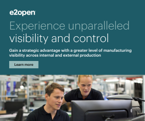
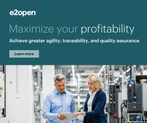
Hi @liz.olson@e2open.com--thanks again for sharing these ads! Feedback below:
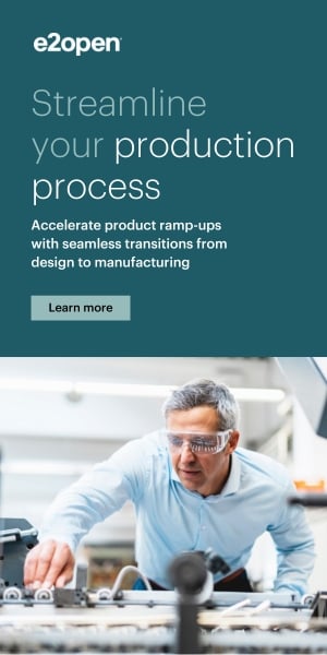
- Consider making the copy more explicitly tailored to your audience of tech manufacturers--with an industry-targeted 1:few campaign like this, you can be more personalized with your messaging. I'll share some examples of how to do this below.
- On both ads, the copy is a bit too dense. And on the first ad, it's too long. We recommend no more than 10 words max for heading copy and 15 words max for heading + subheading copy combined, with short, streamlined sentences that readers can easily digest.
- Keeping in mind both of the points above, here are some potential iterations to try:
First ad
Heading: Experience unparalleled manufacturing visibility
Subheading: Gain control across your production cycle
CTA: Learn More
Second ad
Heading: Maximize your manufacturing profitability
Subheading: Achieve superior agility & quality assurance
CTA: Learn How
- On both ads, increase the size of your subheading copy; it looks like it could pose readability issues, particularly on mobile. We recommend 12 px minimum for all fonts.
- Make the CTA a bit larger to optimize its clickability. We recommend that heading copy be the largest element on an ad, followed by the logo and CTA (roughly size aligned), and then the subheading. The CTA looks too small relative to the logo and other elements and is getting a little lost.
- Here are a couple options to make everything fit with the larger subheading and CTA:
Include a cropped photo in the bottom right corner instead of taking up the entire bottom portion of the ads.
Move the logo next to the CTA, under the copy. Left align the logo and right align the CTA so the CTA is the last thing the reader lands on.
- Your images are strong on contextual relevance and general quality. But they feel a bit stiff and staged, and don't do enough to catch the eye. We find that more naturalistic, inviting images work best. Photos of people staring at or toward the camera (with relaxed and positive expressions) and those featuring natural movement can work particularly well. A soft focus background can also be effective, as it keeps the focus on the subject and draws the reader in. Here are some contextually relevant examples our designer pulled of these best practices in action.


Hope that helps! Let us know if you have any other questions.
1 -
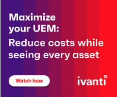
Thank you, @Nikki Gloudeman!! Great advice. I need to update these ads ASAP! Can you help me with suggestions on two other ads? Same campaign as above.
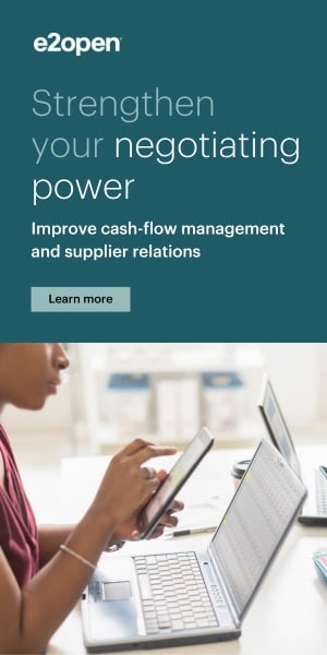 2
2 -
@liz.olson@e2open.com Glad it was helpful, and yes, happy to provide more feedback!
In addition to applying the recs above, here are some other things to keep in mind:
- In these vertical ads, you have the room to make the subheading copy and CTA larger without having to move the photo or place the logo and CTA side by side (and the logo-copy-CTA composition works as is). You should probably make the photo a little smaller, though--both to make room and to allow the value prop to visibly take center stage.
- Another thing to consider is centering both the logo and CTA. Left alignment isn't necessarily wrong, but centering these elements can help them stand out more.
- Be careful about composition--it looks like there's a bit more space between the logo and copy than there is between the copy and CTA. Ideally, everything should be evenly spaced apart.
- Here are some ideas on how to streamline/strengthen the copy:
Ad 1
Heading: Streamline your manufacturing production
Subheading: Accelerate ramp-ups with seamless transitions
Ad 2
Heading: Strengthen your negotiation power
Subheading: Improve cash flow & supplier relations
- Imagery-wise, the photo on the first ad is quite strong and you could probably leave as is--though if there's another pic from the same or similar photo series with a person staring more directly at or toward the camera, that could do more to catch the eye.
- The photo in the second ad isn't particularly compelling and doesn't drive home the "Strengthen your negotiation power" messaging. Consider, again, a person staring at or toward the camera, with a natural expression that also conveys the power of strengthened negotiating power and improved cash flow. Passive imagery doesn't fit the messaging.
Hope that helps! Great work on these ads overall!
0 -
Thanks, @Nikki Gloudeman - another home run! I can't wait for 6th Street Live on the 17th.
0 -
Thank you, Liz! So glad you'll be able to join!
0 -
Nikki you are on fire!
1 -
@Nikki Gloudeman I'm hoping to have something to send your way soon. We're in the middle of having a contractor work with us on some new ad copy.
1 -
@Nikki Gloudeman We just launched a new campaign and are seeing OK performance, but often not meeting benchmarks for things like CTR and ACTR. We have 2 messages running, both with the same visual look - but we took a slightly different approach with the copy (question vs. statement). These are promoting short 6-min videos housed on our website that are part of a series. Any recos/thoughts you have on how to improve would be greatly appreciated! I only included the 300x250s below but we are running the 4 main sizes (300x250, 728x90, 300x600 and 320x50)
 1
1


Categories
- All Categories
- 20 Maturity Model
- 5 Groundwork Use Case Playbooks
- 7 Transform Use Case Playbooks
- 6 Maximize Use Case Playbooks
- 1 Roadmap
- 1 Crossword
- 734 All Discussions
- 55 Product Updates
- 61 6th Street
- 12 Welcome
- 4 Administrator Certification
- 3 Sales Certification
- 10 Advertising Certification
- 10 Demand Gen Plays
- 21 Reporting HQ
- Business Value Assessment (BVA)
- 38 AI Email
- 3 What is CE
- 8 Getting Started with CE
- 16 Thriving with CE
- 6 Conversation Starters
- 203 Job Board
- 34 General
- 11 Partner Place
- 200 Research Road
- Compensation Calculator
- 79 Sales
- 14 Pipeline Generation Tuesdays
- 20 BDR Block
- 11 SKO Supplies
- 7 Advice
- 2 Assets
- 20 Verticals
- 10 Manufacturing, Logistics & Supply Chain
- 8 Financial Services
- search-results
- 291 Events
- 12 6sense Quarterly Product Update (Recordings)
- 26 Customer Story Hour (Recordings)