Creative Services Ads Review to Boost ROI
Comments
-
Hi @KristaB! Thanks so much for sharing these. Really like them overall (you're always on point with your creatives), but I'll share some feedback by tomorrow to optimize them further!
1 -
Hi @KristaB See feedback below. Thanks again for sharing these ads!
- On the first ad, to make the copy more readable, you might want to play more with size contrast. For instance: Make “Maximize your UEM:” one line and slightly smaller while keeping “Reduce costs…” roughly the same size as it is now.
- Small thing, but active copy is stronger than passive copy. So "Reduce costs & see every asset" would be more impactful than "Reduce costs while seeing every asset."
- The copy on your second ad ("Your UEM can reduce your tech stack with asset discovery") is a bit dense. Consider using the flag to help break things up; instead of "Did You Know," the flag copy could say something like "UEM Level-Up." This would allow you to streamline the copy to "Reduce your tech stack with asset discovery" while still getting UEM in the ad.
- Our team generally likes your stepped gradient but would advise A/B testing against a smooth transition. The stepped gradient is visually compelling but could potentially pose readability issues with the hard lines running through the text.
- Switch the order of the logo and CTA, so the CTA is right-aligned and the last thing the reader lands on (people read top to bottom and left to right).
- The white button is effective, but we'd suggest a darker color for the copy - your purple tends to work well. This would also work well with the switched CTA-logo order against the gradient.
Hope this helps! Let us know if you have any other questions.
2 -
Thanks so much for the detailed feedback @Nikki Gloudeman . I will be sure to share with our team as we start thinking about the next round of ads for this campaign!
1 -
@Carey Straetz (she/her) Just in case you'd like to have the team review any new display ads you are setting up!
1 -
Hello!
First of all, this thread is a gold mine of learning opportunities! Thank you for doing this @Nikki Gloudeman !
These are a couple of ads that we are running that are our highest performing in our targeting. While it is great to see that these are our highest performing ads, we are hoping to figure out how to make them better and then spread the learning out across all of our ads.
Other helpful info is that, while we are a B2B focus, these ads are focusing on trying to get higher-level positions to interact with our podcast that speaks to pain points that they encounter. (It is also a really enjoyable true-crime style podcast, just saying 🤠)
Excited to hear any feedback. From the simple to the complex, please let me know the team's thoughts (are the CTA's clear? Do buttons perform better? Imagery?)
Cheers,
Kyle
 1
1 -
Hi @kbaudour so glad you've found the thread helpful and thanks for sharing these ads (+ glad to hear they've been performing so well)! I'll get you feedback by tomorrow at the latest.
1 -
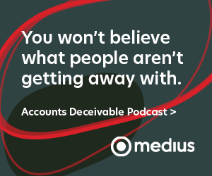
Hey @kbaudour Overall these ads are strong and I see why they've performed well! Below are a few tips to optimize them even further:
- I love how clever and creative this copy is. But on the 300x250 ad, it's necessitating a dense, long CTA that isn't as clickable as it could be and may pose readability issues, particularly on mobile. There are a few ways you could address this.
You could add a flag at the top with the podcast name, "Accounts Deceivable Podcast." Then keep the copy the same and change the CTA to "Listen Now." So it'd read as:
Flag: Accounts Deceivable Podcast
Heading: You won't believe what people aren't getting away with.
CTA: Listen Now
Alternatively, you could add some subheading copy. For instance:
Heading: Discover what people aren't getting away with.
Subheading: Listen to the Accounts Deceivable Podcast.
CTA: Tune In Now
- On the leaderboard, are you also promoting the podcast? It's definitely not clear that this is the case if so. Moreover, there's a general disconnect between the copy and CTA. I'd need to see the landing page to offer more specific advice here, but keep in mind that the CTA should link seamlessly to the copy; you don't want the reader to be confused about what they'll get by clicking.
- You don't necessarily have to use CTA buttons, but generally speaking they perform well--and I think they'd perform better in these particular ads (the CTAs are getting a bit lost as is). Keep in mind that CTA buttons should utilize a bold color that contrasts strongly with the background color, and that the copy should also be bold and easy to read.
- Another note on CTAs: They should always be the last thing the reader sees. Since people read left to right and top to bottom, consider these compositional changes on the ads:
300x250
Either move the logo to the top or (if you include the podcast flag there) situate it next to the logo, with the logo on the left and the CTA on the right. Note that this will only work with the streamlined CTA copy.
Leaderboard:
Move the logo to the far left. Then keep the composition as is OR situate the CTA to the right of the copy (in the button) instead of stacking it underneath.
- Graphical backgrounds can work, but the background on the 300x250 ad is overly busy and detracting from the copy. The leaderboard background is more subtle and therefore stronger. Consider using the red background on the 300x250 as well. You may also want to try a solid color or color gradient background AND/OR imagery (photos of people work particularly well), perhaps in an A/B test. Though note that we don't recommend imagery on leaderboards, so that approach would only be for the non-leaderboards.
Hope this helps! Let me know if you have any other questions.
1 -
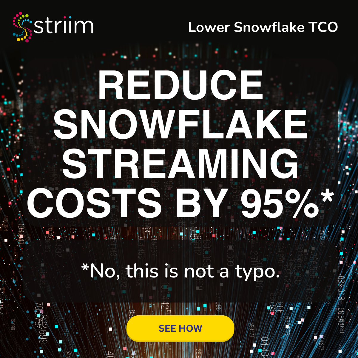
Finally, I get to join in. We've been reworking our creative internally and built this based off of a benchmark report.
1 -
Hey @Brandon McBride thanks for sharing this ad!
FIrst of all, I love the copy--it's active, clear, stat-driven, and clever. 10/10, no notes. Just a few notes on the visuals to help this excellent messaging sing:
- The black box overlay for the copy is a bit awkward. You can try darkening the background image so the white copy pops against it without needing the overlay. Or you can consider a less busy backdrop altogether (even a solid color or color gradient should suffice--the copy is strong enough to take center stage).
- If you do keep this background image, I'd recommend finding a version without the numbers (unless this is just because it's a preview image?). The numbers are visually overwhelming and detract from the value prop.
- The CTA button is a bit small. We generally recommend these buttons be just a bit smaller than the heading copy, so they don't get lost (as this button is).
- The logo could be a smidge larger too--roughly size-aligned with the CTA. The copy is large and all caps, so you have some room to reduce its size to make room for these enlarged elements.
- Is the "Lower Snowflake TCO" copy necessary to include? Totally fine if so, but if you have wiggle room here, I'd recommend removing this. Remember, we want that compelling copy to be the star.
Let me know if you have any other questions!
1 -

Thanks, @Nikki Gloudeman! I really appreciate it. Something more like this, then?
The background was chosen by our contractors. We're mid-redesign, so I'll take all of this back to them. The second ad is a different background they chose, but I dimmed it down quite a bit because it's way too bright on its own.
1 -
Wow, you're fast! This is exactly right @Brandon McBride--this is a much cleaner design that makes the copy easier to digest quickly.
The only lingering thing is the numbers in the background, but I totally understand if there isn't a similar backdrop without them to use--and they're pretty subtle in this dimmed-down version, so not a big issue.
All of which is to say: This looks good to go!
1 -
Hi! I would love to know how we can level up this ad. We kept it super simple and in our main 3 sized formats [300x600, 250x300, 728x90], though I think we could add one more format for better viewability and engagement. One creative is to test our darker pallet and brand unaware/unengaged, and the other in our lighter color and brand aware/engaged accounts. The dark blue performed just below our average CTR and the light blue was slightly behind that. We also are using a native ad which is performing a bit better than the banners and above the average banner CTR. Thank you for helping!
1 -
Thanks for sharing these, @ashley.hanson! Our team will get you feedback tomorrow.
1 -
Hi @ashley.hanson, thank you for sharing these ads! If you’re thinking about adding another ad size into the mix, we recommend the 320x50, which is a high-performing, high-reach ad size. Native ads tend to have a higher CTR than banner ads (.06-.08% vs. .05-.06%), so it totally makes sense that you’re seeing better performance on native.
It’s also worth noting that A/B testing is an effective way to drive up CTR and glean actionable intel. We recommend launching campaigns with at least 2 distinct ad groups to start, featuring one isolated creative variable (e.g., same visual approach, different copy). Once the ad groups have reached >50K impressions, turn off the lowest-CTR ad group and iterate on the highest-CTR ad group (by, for example, taking the winning visual and pairing it with new copy). Note that each campaign should optimally focus on one objective (whether it be downloading a report, requesting a demo, etc.) to keep this A/B testing clean.
Without further ado, please see below for our feedback:
- Consider using images of people looking directly at the camera, with a relaxed & friendly expression, as these tend to perform well. Images should also contain a clear, strong focus so the ad is eye-catching and easy to see. In the dark blue ad, the focus is on the person’s hands, which isn’t as visually appealing.
- The heading copy, logos, and CTA in the dark blue ad are pretty small. To help strike the right balance, use sizing to establish a clear hierarchy of importance. As a general rule of thumb, follow this compositional structure: heading copy (largest size), logo & CTA (medium size), and subheading (smallest size). The light blue ad could benefit from streamlining some of the visual elements, by, for example, removing the rectangular graphics surrounding the subheading copy. Establishing a clear hierarchy of importance would also help create better compositional balance.
- Ad copy should always be active rather than passive to compel the reader and invite action. For example, with these ads, you can try something like:
Heading: Discover why Constructor is No. 1 in commerce search & product discovery.
CTA: Download Report
- If the asset tied to the landing page is a report (as is the case with these ads), you can consider incorporating a compelling stat from the report. This is something you can try in an A/B test.
- The ad copy in the light blue ad runs a bit long. Keep in mind that your ad copy should be short. We recommend 10 words max for heading copy & 15 words max for heading and subheading copy combined. Due to their limited real estate, leaderboard ads should contain even shorter copy at 10 words max.
- To keep the CTA streamlined, avoid filler words like “the.” For example, you can get away without the “the” in the light blue ad.
Hope this helps! Please let me know if you have any other questions!
2 -
Hello,
Looking to get feedback on a couple new ads we're putting into market.


Alternative LI ad copy we're going to use: Elevate IT Efficiency: Empower Your Teams with Pantheon
2 -
Hey @Caroline_Alex, thanks so much for sharing these ads! I'll get you feedback by tomorrow at the latest.
1 -
@Caroline_Alex see my feedback below and don't hesitate to let me know if you have any questions!
- This copy is clear and concise, but on the playbook ad, it's a little dense with the use of two acronyms. In general, we recommend no more than one acronym in an ad to ensure easy readability.
- We generally find that active copy geared toward the reader is more effective at compelling action than the passive copy leveraged in both these ads. For instance, something like "Elevate your performance with the definitive higher-ed IT playbook" might be more effective than "The definitive EDU IT playbook." Similarly, "Align your people, processes, and platforms" is stronger than "Aligning people, processes, and platforms."
- Try to keep the introductory copy under 150 characters to avoid it being cut off.
- On the playbook ad, your image has 3 different effects: a gradient colorization effect on the book stack, a black and white effect on the people, plus a gold colorization on the laptops. Colorization and desaturation alone will affect a reader's ability to recognize an image; combined with the fact that the people are very small sitting on a book stack (so the scale isn’t true to life) makes it even harder to easily parse what's being shown. There’s nothing wrong with playing with scale in general, but this combined with the colorization and desaturation are making for a very busy image. Consider choosing one of these effects (colorization, desaturation, or playing with scale). And if you choose colorization, limit it to just part of the image.
- Your logo is overpowering your copy. Your value/prop copy should always be the largest element in your ad, followed by your logo and CTA if you have one (roughly size aligned) and then subheading copy. The copy is also a bit small in general; consider playing with the crop and zoom of the images to make space to enlarge the copy, so it dominates visually.
Hope that helps! Let me know if you have any other questions.
1 -
@Nikki Gloudeman would love feedback on these two ads below! This is a format we tend to use often. One is for an awareness-level ad for an ebook, the other is for our BOFU demo request ads.
 2
2 -
Thanks for sharing these, @Yen Dinh! Will get you feedback asap—should be by EOD tomorrow!
1 -
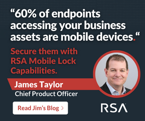
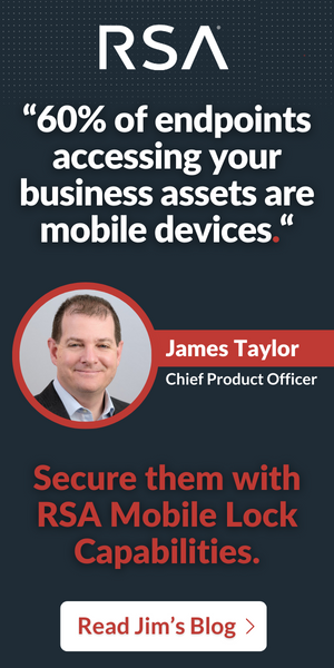
I'm planning to run these in January - they're one of our most-read Blogs around Mobile Device security I'm planning to send to accounts researching around this topic.
This is the Blog - I took one of the key stats and pulled it out for the Ad headline.
 1
1 -
Hey @Rob Cook! Would you mind reposting in this thread?
2 -
@Kimberly Conklin - sure - done!
2 -
Hi @Yen Dinh thanks again for sharing these ads! See feedback below.
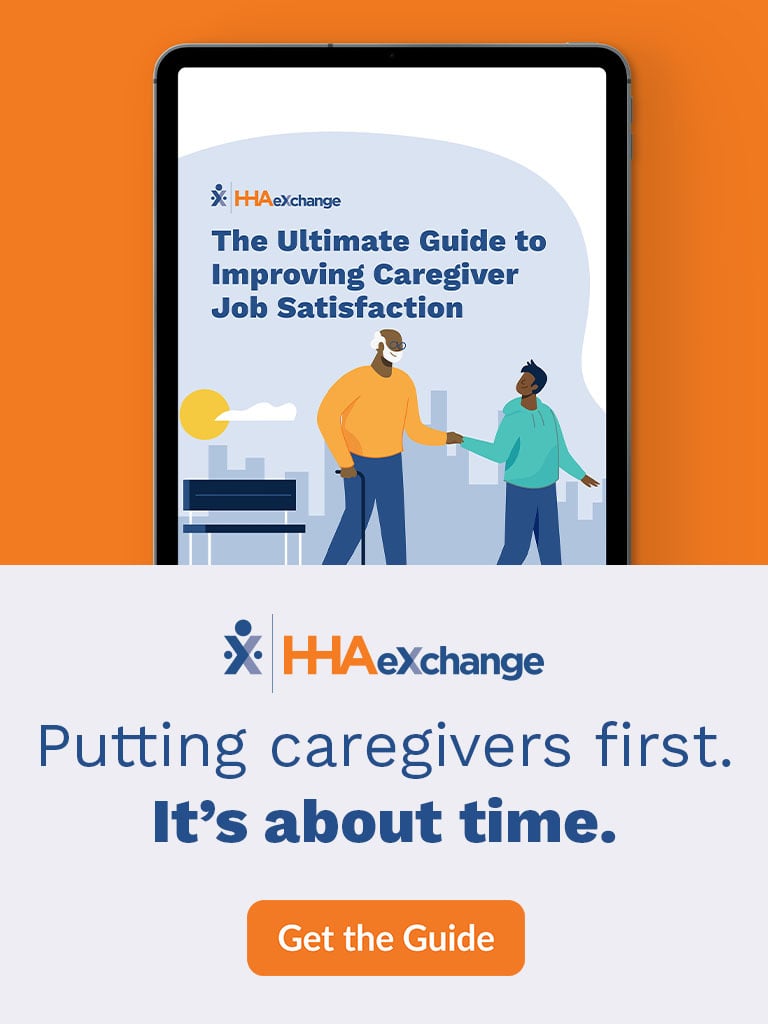
E-book ad:
- We generally advise against using text in imagery, as it can pose readability issues (particularly on mobile). The ad format is large enough to where this may not be an issue, but it's good to keep this in mind.
- If you did remove the imagery with the copy, you could tweak the copy to weave the guide content into the messaging. So something like: The ultimate guide to improving job satisfaction puts caregivers first./It's about time.
- The copy/value prop should ideally dominate the composition, rather than the imagery. Consider making the messaging larger and the imagery less prominent.
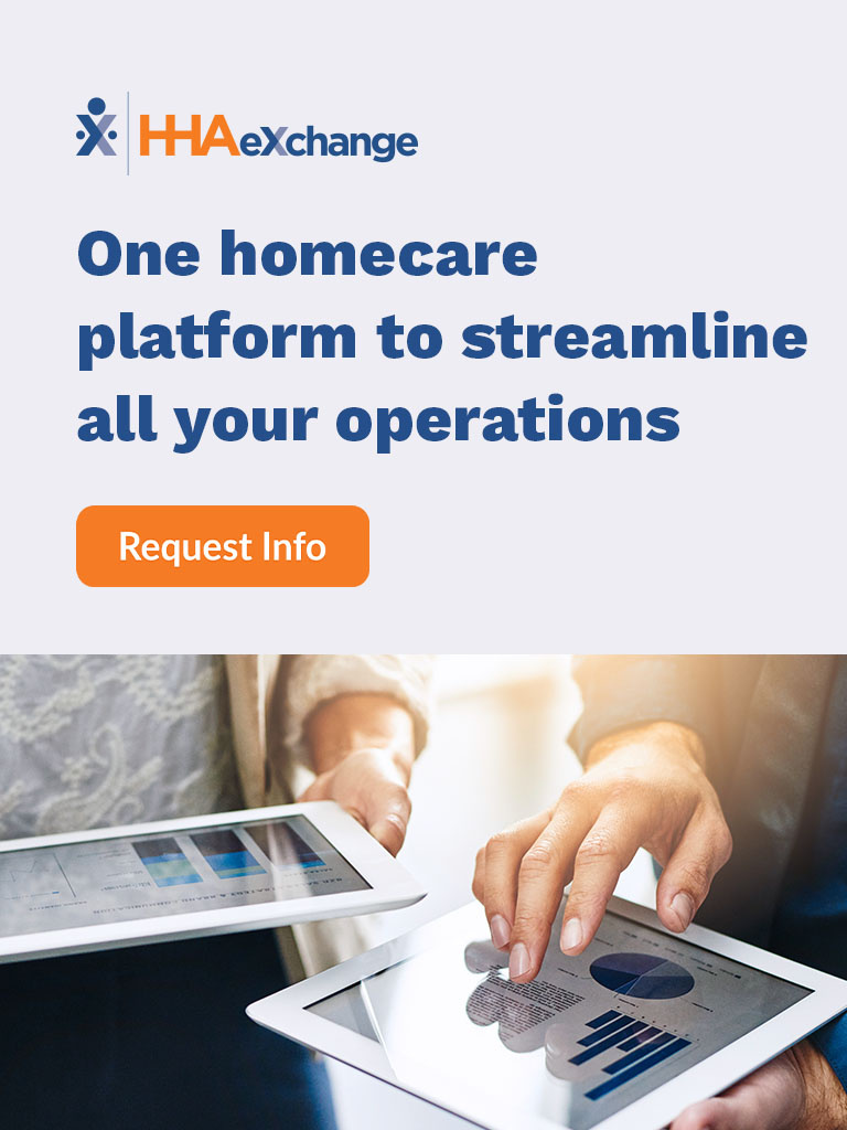
Demo ad:
- This copy is streamlined and strong—but considering this is an engaged audience and relatively high-friction asset, it could do more to drive home the value of the product. Are there any specific stats or facts you could highlight to prove the value of the platform? Or any social proof to share? This copy, which conveys the general value prop, feels more aligned to a top-of-funnel play.
- You may want to experiment with a different CTA; "Request Info" suggests an elaborate process that may be intimidating. Something like "See Demo" might be more inviting.
- You may want to try a different photo—this imagery has text that will certainly be too small to read. And people photos typically work best when they feature a person's face. (People staring directly toward the camera, with a relaxed and friendly expression, work best.)
Hope this helps! Let me know if you have any other questions.
2 -
Hello could you please help with the following the avg CTR is 0.02%
1 -
Thank you so much @Nikki Gloudeman!
2 -
would love feedback on these ads, they are under performing IMHO but the campaign is too important to just let them be. Thank you

 0
0 -
Hi @vabramson , I'd be more than happy to provide some feedback on the following ads.
Please allow me until Tuesday 1/9 to deliver feedback. Thanks!
0 -
Hi @vabramson ,
Here is my feedback regarding the following ads.
Visual Approach:
1) Use human faces. Images of people staring directly at the camera, with a relaxed and friendly expression, routinely perform well.
2) All MedRec ad sizes (300X250, 300X600) should employ a CTA button that is clearly defined against the background color.Copy Approach:
1)Use Power Verbs: Leverage strong, actionable verbs or verb-driven phrases to generate interest, like "transform, kickstart, accelerate, or kick up a notch."
2) Make sure your messaging is aligned with the value proposition presented on the landing page.
CTA Approach:1)Stick to 3 words max and use inviting verbs. Keep you CTA short, concise, and action drive. Use inviting verbs such as "Learn, See, or "Watch" to entice the user to click.
Lastly, are you utilizing all the top-performing ad sizes (300X250, 300X600, 320X50, and 728X90 in your ad groups?
I hope this feedback helps. In addition to it, I'm also attaching our Ad Creative Best Practices for your reference.0 -
Hello,
We would love you feedback around a few ads we are looking to launch here soon! thank you in advance for any advice and suggestions! :)
Awareness Display Ad V1 (this are showing up a bit blurry)
Awareness Display Ad V2
Awareness Display Ad V3

Consideration Linkedin Ad V1

Consideration Linkedin Ad V2
 2
2 -
Hi @Lindsay O'Neal, happy to take a look! I should have my feedback by EOD tomorrow.
1


Categories
- All Categories
- 20 Maturity Model
- 5 Groundwork Use Case Playbooks
- 7 Transform Use Case Playbooks
- 6 Maximize Use Case Playbooks
- 1 Roadmap
- 1 Crossword
- 734 All Discussions
- 55 Product Updates
- 61 6th Street
- 12 Welcome
- 4 Administrator Certification
- 3 Sales Certification
- 10 Advertising Certification
- 10 Demand Gen Plays
- 21 Reporting HQ
- Business Value Assessment (BVA)
- 38 AI Email
- 3 What is CE
- 8 Getting Started with CE
- 16 Thriving with CE
- 6 Conversation Starters
- 203 Job Board
- 34 General
- 11 Partner Place
- 200 Research Road
- Compensation Calculator
- 79 Sales
- 14 Pipeline Generation Tuesdays
- 20 BDR Block
- 11 SKO Supplies
- 7 Advice
- 2 Assets
- 20 Verticals
- 10 Manufacturing, Logistics & Supply Chain
- 8 Financial Services
- search-results
- 291 Events
- 12 6sense Quarterly Product Update (Recordings)
- 26 Customer Story Hour (Recordings)