Creative Services Ads Review to Boost ROI
Comments
-
Great! Thank you so much!! I forgot a final one:
for 6QA Prospects as a Linkedin carousel ad:
Thanks so much again!!
0 -
Hi @Lindsay O'Neal! Please see below for my feedback:
Display Ads
- We suggest adding a 320x50 into the mix, which is a top-performing ad size and can help boost CTR.
- While the ad images are contextually relevant, we’ve seen that images of human faces looking directly at the camera (for display ads) generally perform well.
- The 300x250 and 300x600 have text overlaid on an image, which can pose potential readability issues. The 300x600 is large enough to where this may not be an issue, but it’s good to keep in mind.
- The CTA and logo on the 300x250 are a bit small. The logo and CTA should be similarly sized, and the CTA should be large enough to stand out, but not so large that it crowds out the copy. As a rule of thumb, make the CTA slightly smaller than the heading text, in line with the logo size. I would probably also bold the subheading copy so that it’s easier to read.
- Due to their limited real estate, avoid using imagery on leaderboard ad sizes. Focus solely on the copy, logo, and CTA. You can get away without a CTA button on leaderboards if the copy is actionable enough to serve as a de facto CTA. (BTW, love the use of the arrows in place of a CTA! This is effective for leaderboards. More on that below.)
- In the case of the 728x90, for the ad messaging to work more effectively without a CTA button, I suggest adding a verb. For example, you can try something like: “Discover the Cost of Managing Compensation with Spreadsheets.” I would also left-align the logo so that you have the logo followed by the copy.
LinkedIn Ads
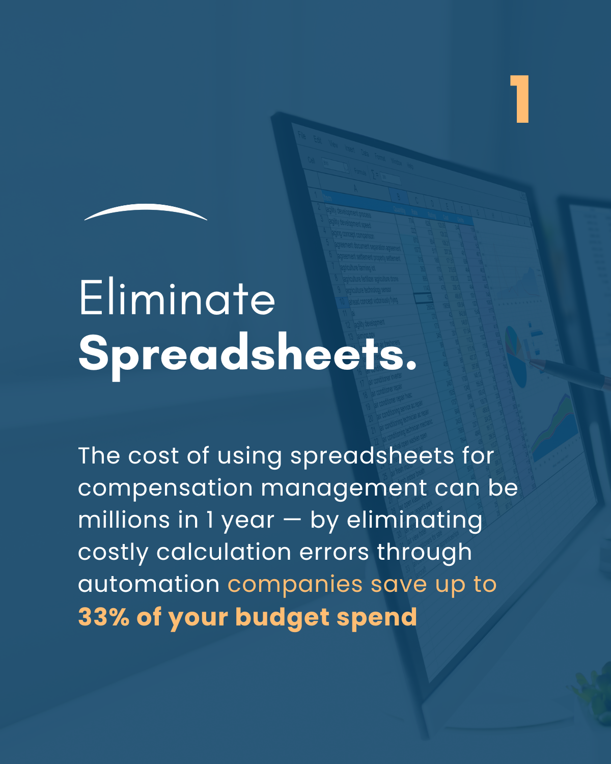
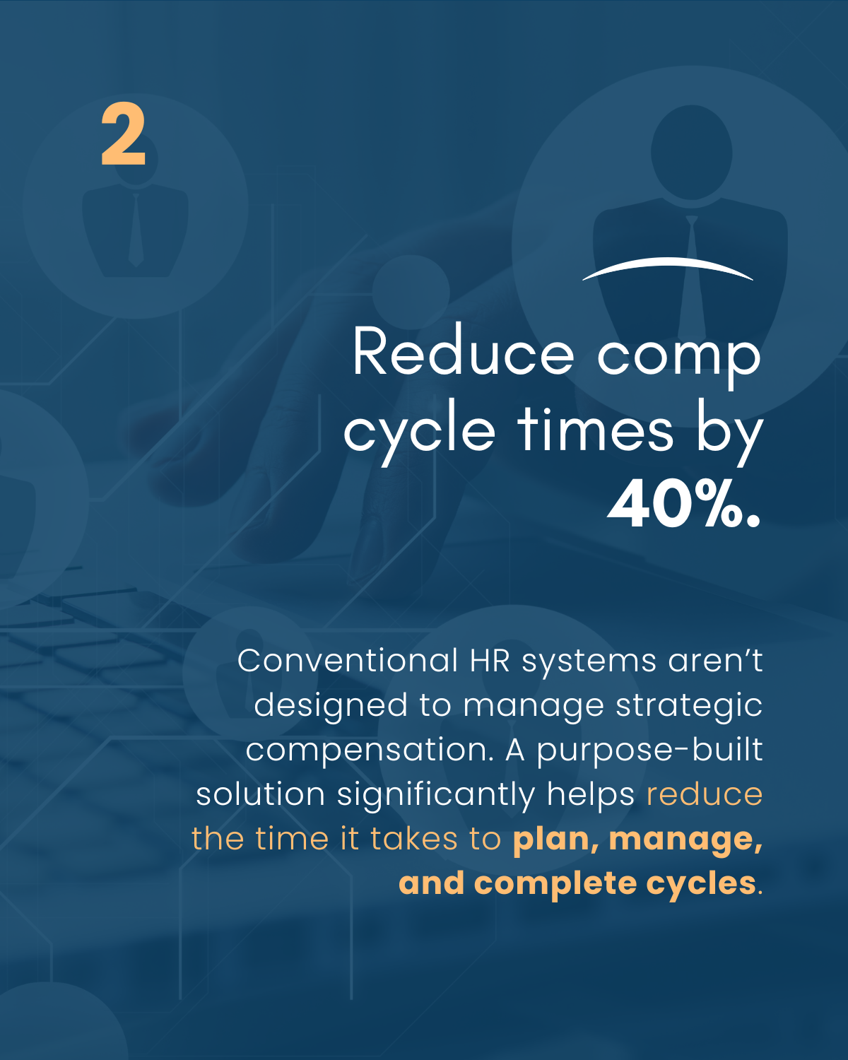
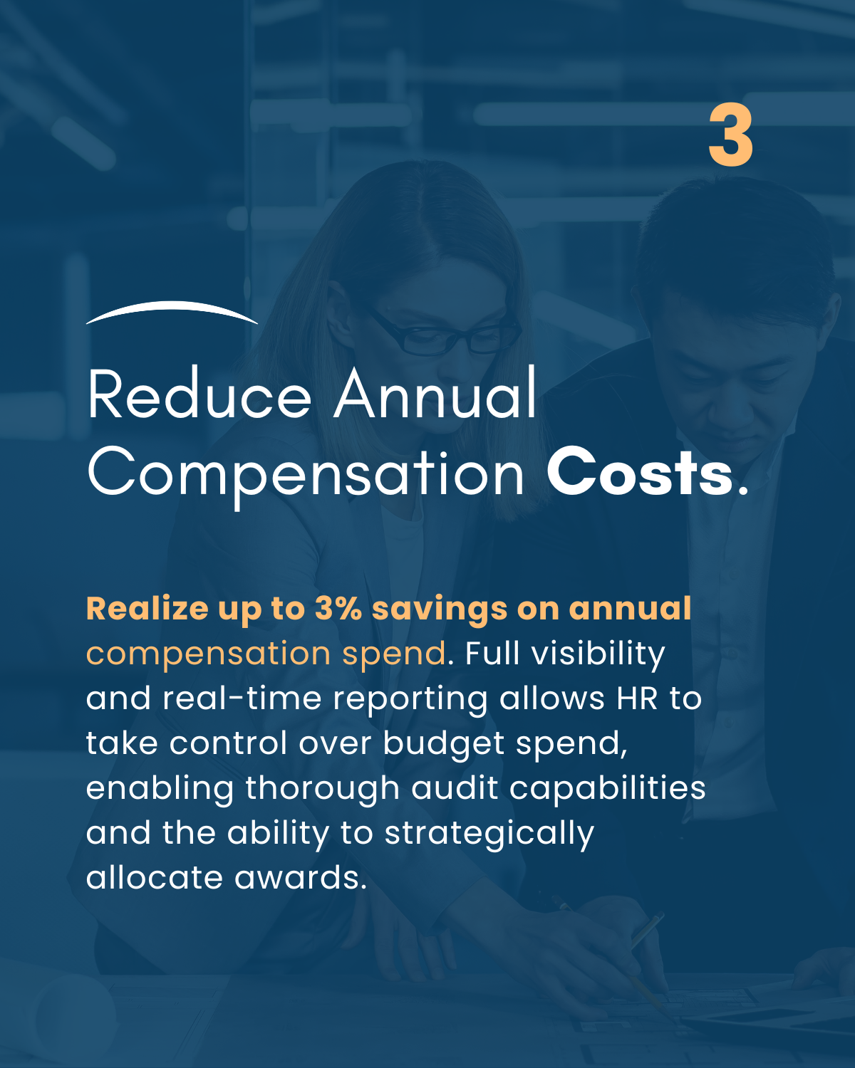
These ads are strong! They’re clean, the copy is active and emphasizes the value prop, you’re using a contextually relevant photo, and you’ve established a clear visual hierarchy of importance—all best practices. I don’t have a whole lot of additional feedback to share, just a few suggestions:
- To help ensure healthy reach and optimize inventory, consider adding the 4:5 aspect ratio (with 1:1 as an optional) into the mix.
- This is very minor but be sure to use consistent capitalization. Looking at your ads, it appears that HRSoft’s style is to use title case for heading copy and sentence case for subheading copy. However, the subheading copy on the LI ads is a mix of both. I suggest lowercasing the “Q” in “Questions” and the “D” in “Digital.”
Hope this helps! Please let me know if you have any other questions.
1
This discussion has been closed.
Categories
- All Categories
- 20 Maturity Model
- 5 Groundwork Use Case Playbooks
- 7 Transform Use Case Playbooks
- 6 Maximize Use Case Playbooks
- 1 Roadmap
- 1 Crossword
- 734 All Discussions
- 55 Product Updates
- 61 6th Street
- 12 Welcome
- 4 Administrator Certification
- 3 Sales Certification
- 10 Advertising Certification
- 10 Demand Gen Plays
- 21 Reporting HQ
- Business Value Assessment (BVA)
- 38 AI Email
- 3 What is CE
- 8 Getting Started with CE
- 16 Thriving with CE
- 6 Conversation Starters
- 203 Job Board
- 34 General
- 11 Partner Place
- 200 Research Road
- Compensation Calculator
- 79 Sales
- 14 Pipeline Generation Tuesdays
- 20 BDR Block
- 11 SKO Supplies
- 7 Advice
- 2 Assets
- 20 Verticals
- 10 Manufacturing, Logistics & Supply Chain
- 8 Financial Services
- search-results
- 291 Events
- 12 6sense Quarterly Product Update (Recordings)
- 26 Customer Story Hour (Recordings)


