Ad Creative Review to Boost ROI (January 2024)


Looking to improve your ads to increase engagement and performance? The 6sense Creative Services team can help!
Share 1-2 ad creatives in this discussion thread and we'll provide actionable insights to optimize elements like copy, visuals, and CTAs. We can even draft you copy ideas and, where relevant, show you new designs and imagery to try.
Sometimes simple changes can go a long way. We'd love to help you build ads that drive results.
*If you're looking for more extensive consultative support or want our in-house experts to design, build, and/or launch ads for you, reach out to your CSM or email creativeservices@6sense.com.
Comments
-
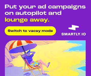
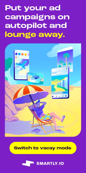
Hi @Nikki Gloudeman ! We are getting ready to launch our first Vertical campaign for Smartly.io focused on the Travel vertical (airlines, lodging, OTAs, cruises). Our landing page is still in development, but I'd love your feedback on these creatives. The concept is that with Smartly.io, marketers can put their campaigns on autopilot and take a well-earned vacay.

 4
4 -
Thanks for sharing @kendallmason_smartly! Will get you feedback by EOD tomorrow :)
1 -
Hi @kendallmason_smartly, see feedback below!
- Love this copy! Fun, streamlined, and conveys the value prop clearly.
- We generally advise against illustrations, but I like this one; it's custom, thoughtful, and complements the copy nicely. But I would make it smaller, so the elements aren't so tightly packed and the copy—instead of the visual—dominates the composition more.
- I'd also consider moving the logo to the top of the 300x600 and to the left of the CTA on the 300x250. The CTA should be the last thing people see, and people read left to right and top to bottom.
- On the leaderboard, the composition could be strengthened. There's room to shift the illustration further to the right and off the page to enlarge the headline. And move the logo to the left of the copy for a more intuitive order of elements.
Overall, these are really strong ads. Just a couple little compositional tweaks should help.
Let me know if you have any other questions!2 -
@Nikki Gloudeman thank you so much for the feedback — I meant to get back to you sooner than this 😊 We have incorporated your comments, really appreciate the insights.
1 -
No problem @kendallmason_smartly—glad the feedback was helpful! Let me know if you have any other questions.
1 -
Thanks for continuing to do this. I would love to get some feedback on our creatives. Here's one we ran recently but it's pretty common for our ads:


 1
1 -
These ads mostly adhere to our best practices. The only piece of feedback I have is that in the top ad, the person on the radio looks a little cutout/doesn't blend seamlessly with the background, like the bottom 300X600 ad with the man holding a clipboard. I would recommend employing that gradient/blended background template as it's easier on the eyes.
In addition to that, make sure Autodesk is also using the top-performing leaderboard ad sizes (728X90 and 320X50).
Please let me know if they have any follow up questions.
1 -
@Barclay.Idsal Thanks! I appreciate it. We're an Autodesk provider, not Autodesk :). I passed the information along to our creative team.
1 -
Hello @Nikki Gloudeman we are getting ready to launch our first ads on DSP platform and would love to get some feedback on the ads. Thank you in advance for your help.
 1
1 -
Hi @Max.Edwards ,
I'd be happy to offer my feedback here.
First off, I'd recommend the client makes sure they are utilizing the 4 top-performing ad sizes. They are: 300X250, 300X600, 320X50, and 728X90. Omit any other ad sizes unless the campaign is retargeting.
In terms of creative feedback, here are my notes.
- Visuals
-The man being used is one of the more commonly utilized people in stock imagery galleries. As such, I would recommend looking for a different subject.
-The visual approach for MedRec sizes (300X250, 300X600) should be relatively the same. If you're using a person in the 300X600, I would encourage also using that person in the 300X250
-Avoid overly noisy visual approaches. The 300X600 size has a lot going on in addition to the man. Consider simplifying the video embed graphic, namely remove the icon bar on the right.
-Consider AB testing leaderboard ad sizes (320X50, 728X90) without a CTA. This approach often gives the message and visual more breathing room and has proved effective in some use cases.
- Copy
-Consider utilizing a subheading to further differentiate your product offering. However, if you do so, make sure to cap the word count at 10 for the heading copy and 15 words for the total word count(heading + subheading copy combined). This would mostly be for the MedRec ad sizes (300X600, 300X250).
Other than that, the main copy is active, the color contrast is quality, and the value prop is front and center. If you make the above tweaks, I would expect better engagement results.
I'm also attaching our Advertising Best Practices as well as Intro to Creative Services decks for their reference. Please let me know if they have any follow-up questions.
All the best,
Barclay
1 -
Thank you for your feedback, we will pass it along to the creative team!
2 -
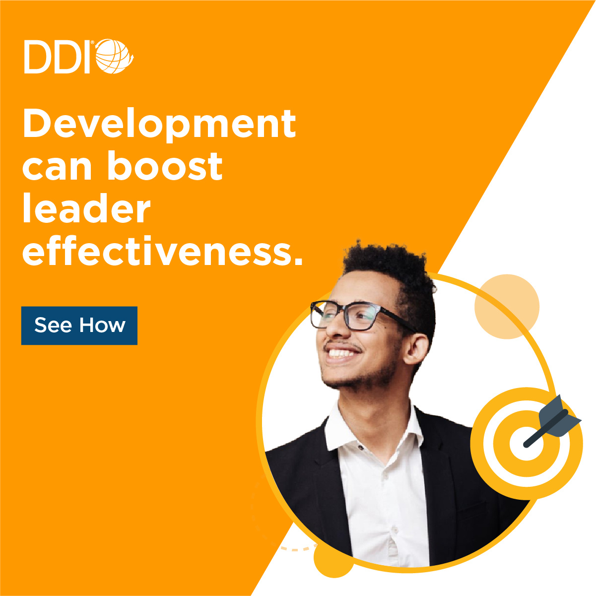
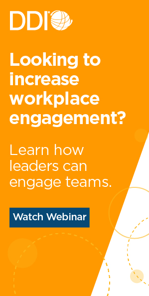
Hey @Nikki Gloudeman
These three ads have been running for about 1.5 months as a part of our leadership development intent campaign (DDI is a global leadership development consultantcy). Each of the ads is mapped to phases of our customer journey, so the first ad hits people in the awareness stage and goes to a top-funnel blog piece (women with the gray shirt on), and the second ad (man copper colored shirt) is for people in the consideration stage and goes to an ariticle from our ultimate guide to leadership development meant for people already further in our funnel, and the last ad (man looking up with a target icon) is for people in consideration/purchase and goes to a client story (bottom funnel). Looking for any tweaks we could try to improve the performance of these ads. Thanks so much for your help!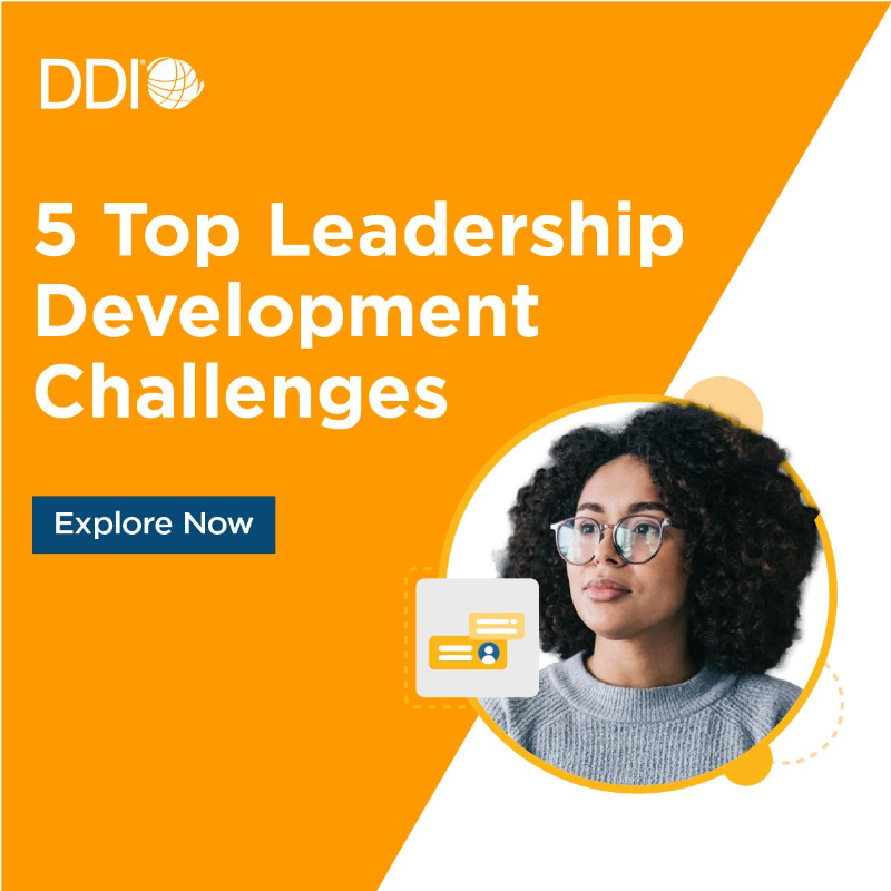

 1
1 -
Hi @Vruta Patel ,
May I ask two questions?
- Are they utilizing all the top-performing ad sizes (300X250, 300X600, 320X50, and 728X90) for each of these campaigns?
- Could I see the landing pages for each campaign?
In terms of the ad creative, my main piece of feedback is that the messaging is missing just a little more detail on why the value prop matters to the ICP. Typically, I like to use subheading text to differentiate the value prop by industry, competitive advantage, or level of excellence, to ensure it matters to the audience in question.
Standing by for further details…
All the best,
Barclay
1 -
Hey @Barclay.Idsal
1) We are using 3 different ad sizes for each of these (300x250, 300x600, 728x90).2) Sure, the landing pages are according to the buying stages:
- Awareness stage -
- Consideration stage -
- Decision/Purchase stage -1 -
I would recommend they add the 320X50 ad size and target mobile inventory unless there is a reason to do otherwise. I can see a case to be made for not targeting mobile at the purchase stage, but they should most likely include mobile ad inventory and the 320X50 ad size for awareness and consideration campaigns.
For the following campaigns, I would recommend adding short subheading text (5 words or less) to the ad creatives in order to touch on the detailed aspects of the value proposition(s), which are subsequently listed on the landing pages. An example for the Awareness campaign might look something like this:
Heading: Top 5 Leadership Development Challenges
Subheading: Empower your HR pros today.
CTA: Explore Now
As always with any copy additions, make sure to align your new text elements comfortably, eliminating any excess white spice while not pushing the text too close to the border of the ad.
Other than that, I think these ads adhere to most of our 6sense display best practices, which I'm also including here as well. I think if they add the 320X50 ad size to their regular ad sizes, they'll see a significant uptick in CTR and engagement rates. Please let me know if they have any follow-up questions.
All the best,
Barclay
1 -
@Hanna Sorjonen tagging you in here as you may want to leverage the team on some feedback and guidance, as is onoffer here.
0 -
@Nikki Gloudeman my 6sense customer Staffbase has had some questions on LinkedIn assets, do you provide guidance additionally for this channel ? cc: @Giovanni Picone
0 -
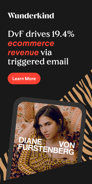
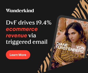
Hi team! @Nikki Gloudeman @Barclay.Idsal
We're working on launching on first 6sense ad campaign, and would love to get feedback on the ads. All of the ads are based on intent terms, using specific keywords in the creatives.
All of them are developed in: 300 x 250 | 320 x 50 | 728 x 90 | 300 x 600
In the last visual we compared using yellow vs. red, and we think we should move forward with the

 1
1 -
Hi @Paulo Moreira , we can provide feedback on LinkedIn creative assets as long as they are single image ads. Feel free to reach out via creativeservices@6sense.com
0 -
Hi @joycekremer, thanks for reaching out! Very exciting to be launching your first 6sense ad campaign! Happy to take a look at your creatives and provide feedback by EOD.
0 -
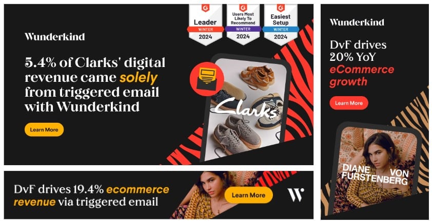
Hi @joycekremer, congrats again on launching your first 6sense campaign! You’re off to a good start by running the top-performing ad sizes. A few other things to keep in mind:
-We generally always suggest A/B testing, which is a great way to glean actionable intel and drive up CTR. To do this effectively, we recommend launching campaigns with at least 2 distinct ad groups to start, featuring one isolated creative variable (for example, same visual, different copy). Once the ad groups have reached >50K impressions, turn off the lowest-CTR ad group and iterate on the highest-CTR ad group—by, for example, taking the winning copy and pairing it with a new visual. Note that each campaign should optimally focus on one objective (whether it be downloading a report, requesting a demo, etc.) to keep this A/B testing clean. For this campaign, since you’re deliberating between red and yellow, you can A/B test both visual approaches and see which one works best.
-Due to their limited real estate, we generally recommend avoiding imagery on leaderboard ad sizes. Instead, focus on the copy, logo, and CTA. Also, make sure leaderboard ads are compositionally balanced. As a rule of thumb, the logo should be left-aligned, the CTA should be right-aligned, and the copy should sit in between both. Alternatively, the logo and CTA can also be stacked on the right, with the CTA on the bottom.
-This applies more to the leaderboard ads, but to avoid posing readability issues or causing visual distraction, make sure to keep the CTA and logo (and all other visual elements) unobstructed.
-While the ad copy clearly emphasizes your value prop, ad copy should be active rather than passive to compel the reader and invite action. For these ads, for example, you can try something like: “Discover how DvF drives 19.4% ecommerce revenue via triggered email.”
In addition to my feedback, I've also attached our Ad Creatives 101 deck, which includes more on best practices and tons of valuable information.Hope this helps! Please let me know if you have any questions!
2 -
Hey @Nikki Gloudeman
All of these ads go to an ungated on-demand webinar: (attaching the link below) and each set has a slightly different flavor. The 300x600 set is exploring the use of people imagery versus no people imagery, and the 728x90 set uses a bold CTA button vs. not having a traditional bold CTA button. Would love some feedback on how we can make these ads even better!

 0
0 -


Categories
- All Categories
- 20 Maturity Model
- 5 Groundwork Use Case Playbooks
- 7 Transform Use Case Playbooks
- 6 Maximize Use Case Playbooks
- 1 Roadmap
- 1 Crossword
- 734 All Discussions
- 55 Product Updates
- 61 6th Street
- 12 Welcome
- 4 Administrator Certification
- 3 Sales Certification
- 10 Advertising Certification
- 10 Demand Gen Plays
- 21 Reporting HQ
- Business Value Assessment (BVA)
- 38 AI Email
- 3 What is CE
- 8 Getting Started with CE
- 16 Thriving with CE
- 6 Conversation Starters
- 203 Job Board
- 34 General
- 11 Partner Place
- 200 Research Road
- Compensation Calculator
- 79 Sales
- 14 Pipeline Generation Tuesdays
- 20 BDR Block
- 11 SKO Supplies
- 7 Advice
- 2 Assets
- 20 Verticals
- 10 Manufacturing, Logistics & Supply Chain
- 8 Financial Services
- search-results
- 291 Events
- 12 6sense Quarterly Product Update (Recordings)
- 26 Customer Story Hour (Recordings)