Ad Creative Review to Boost ROI (December 2023)


Looking to improve your ads to increase engagement and performance? The 6sense Creative Services team can help!
Share 1-2 ad creatives in this discussion thread and we'll provide actionable insights to optimize elements like copy, visuals, and CTAs. We can even draft you copy ideas and, where relevant, show you new designs and imagery to try.
Sometimes simple changes can go a long way. We'd love to help you build ads that drive results.
*If you're looking for more extensive consultative support or want our in-house experts to design, build, and/or launch ads for you, reach out to your CSM or email creativeservices@6sense.com.
Comments
-
BUMP! This is a great resource. 😎
2 -
A great resource and opportunity indeed. Take advantage RevHeads
2 -
@EliciaBuonocore FYI in regards to our campaign optimization conversation. Check out this resource from our Creative Services Team!
3 -
Hi team, here are 2 versions of the same ad for an ad campaign around a webinar recording.
We've got all the dimensions for static programmatic ads as well as for LinkedIn.
2 -
Thanks for sharing these ads, @Nick Kuiper! Will get you feedback asap.
0 -


Awesome! I think these might have too much text but curious what you think!
1 -
Hi @charlotte.spangler! Thank you for sharing! I should have my feedback ready for you by EOD.
1 -
Thanks again for sharing your ads, @charlotte.spangler! Please see below for my feedback:
-While your ad copy does an excellent job at emphasizing the value prop and keeping the copy active, it does run a bit long. Our recommended word count is 10 words max for heading copy and 15 words max for heading + subheading copy. Here are some streamlined copy alternatives to consider:
Ad #1:
Heading: More intelligence. Greater results.
Subheading: Drive successful marketing outcomes today.
CTA: Learn HowAd #2:
Heading: Less stress. More ROI.
Subheading: Solve your marketing challenges with AI-powered solutions.
CTA: Learn More
-When it comes to visuals, simplicity is key. The use of product screenshots (ad #1), illustrations (the lines/dots/circles graphics in ad #2), and images (ads #1 and #2) can potentially create visual clutter. I would focus on strong color contrasting to catch the eye (which these ads contain—love the gradient CTA and border at the bottom of the ad) and swap the images for images of people looking directly at the camera, as both of these elements tend to generate higher engagement. (We also generally find that images with color perform best.) It’s also worth noting that illustrations and product screenshots tend to underperform against ads that contain the aforementioned visual elements.-Consistent alignment and sizing across copy elements is key to readability. In ad #2, for example, the second line of the heading copy is slightly larger than the first line of copy. The subheading copy on both ads also runs pretty small in proportion to the rest of copy elements. To make sure ads are compositionally balanced, use sizing to establish a clear hierarchy of importance. As a general rule of thumb, follow this structure: heading copy (largest size), logo and CTA (medium size), and subheading copy (smallest size).
-300x600 is among the top-performing ad sizes. To ensure you cover all of the highest-performing, highest-reach ad sizes, I recommend adding 300x250, 728x90, and 320x50 into the mix.
Hope this helps! Please let me know if you have any questions. Thank you!
3 -
Hi @Nick Kuiper, see feedback below! Let me know if you have any other questions.
- Quick note that this particular ad size (768x1024) doesn't have much available inventory--something to consider if you want to focus bandwidth on higher-reach sizes. We recommend the following sizes in general: 300x250, 728x90, 320x50, and (optional) 300x600.
- In general, these ads are a bit visually busy, pulling focus away from the value prop. A few ways to address this:
--Instead of a busy photo-overlay background, use a solid-color or simple color-gradient background.
--Remove the blue line separating the copy from the speaker headshots, and orient this section horizontally rather than vertically, placing it beneath the CTA so there's no overlap.
--Remove "Webinar" at the top and change the CTA from "Watch Now" to "Watch Webinar."
--Move the logos to the top where "Webinar" used to be.
--Make the copy one consistent size. - The copy is using a thin font. Use a thicker font to improve readability.
- The "Automate and drive/Toward the use of AI in fleet management" is a bit awkward. Consider making one sentence and streamlining to: "Drive toward the use of AI in fleet management."
2 - Quick note that this particular ad size (768x1024) doesn't have much available inventory--something to consider if you want to focus bandwidth on higher-reach sizes. We recommend the following sizes in general: 300x250, 728x90, 320x50, and (optional) 300x600.
-
@Nikki Gloudeman Thank you for the feedback!
On the ad sizes: I've taken a look at a few campaigns from Nov and found that the sizes you talked about were usually among the top 3 when it came to impressions and CTR. As well as 320x480 and 160x600.
What I also noticed is that 768x1024 and 1024x768 didn't get any impressions.
Even though the platform shows the message below under 'View accepted file types and sizes' when adding new creatives:
Accepted Creative Dimensions 160x600 300x250 300x600 320x480 320x50 728x90 768x1024 1024x768
Why is that?
1 -
Hi @Nick Kuiper, great question! The 768x1024 and 1024x768 are ad sizes with very limited inventory—not many domains have placements for these sizes. So it's not unusual to see very few (or even no) impressions, which is why we generally advise not including them.
The 320x480 also has limited inventory, though more than the 768x1024 and 1024x768. And it does often perform well.
The 160x600 has plenty of inventory but tends to underperform relative to our recommended sizes. This isn't always the case, though—so if you see it working in your campaigns, you can definitely keep it in the mix.
Let me know if you have any other questions!
1 -
Thanks for explaining Nikki!
2 -
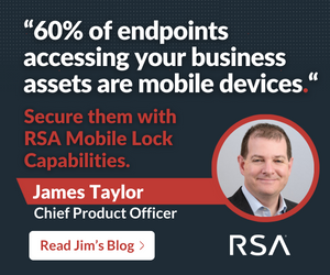
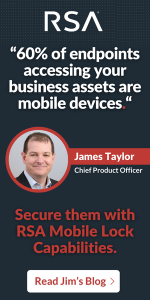
I'm planning to run these in January - they're one of our most-read Blogs around Mobile Device security I'm planning to send to accounts researching around this topic.
This is the Blog - I took one of the key stats and pulled it out for the Ad headline.
For the smaller ads with less space I've taken the CPO name, title etc. out and used 'Learn More' CTA rather than 'Read Jim's Blog' as he isn't referenced in the ad copy.

 2
2 -
thank you @lgallardo this is super helpful!
2 -
Hi @Rob Cook ,
Happy to offer some feedback here. Just so you know, I previously offered creative feedback to Victoria Brown regarding a different landing page/ad creative for RSA.
In terms of this particular creative, I'd recommend the following:- Cap your word count.
Don't exceed 10 words max for heading copy or 15 words max for heading + subheading copy combined. Cut any text that isn’t absolutely essential. This also applies to any job title text.
- Use the top-performing ad sizes.
Unless there's a reason to only go with MedRec ad sizes (300X250 and 300X600) consider employing leaderboard ad sizes as well (728X90, 320X50) as they have quality inventory and perform well against benchmarks.
Other than that, I like the blog, the quote header as well as the active copy in the subhead. Again, I'd simply recommend making your messaging more concise while also adding in the other top-performing ad sizes.
1 -
@Barclay.Idsal - thanks for coming back. Yes, I sent these over to Victoria and she shared the pointers that you offered, which we have largely taken in.
I have also created the 728x90 + 320x50 sizes - I attached these into the post as well. For those I removed the reference to Jim and his job title and changed the CTA to Learn More instead.

I will see how we can shorten the copy. I did originally have shorter copy, but was told by our content team to make the subheadline longer. I'll cut the copy down again.
Appreciate your feedback. As always super useful :-)
1 -
We would love some feedback on the following ads. We are struggling with CTR but have good VTRs.


 2
2 -
Hi @hehorning thanks for sharing these ads! Will get you some feedback by EOD tomorrow.
1 -
Hi @hehorning, see my feedback below!
—Nice job on the copy! Streamlined, compelling, and clearly conveys the value prop.
—Consider changing the CTA copy to just "Get Quote." This will enable you to make the copy larger while avoiding the copy/CTA "Upgrade" redundancy.
—The leaderboard could be streamlined as well—2 lines of copy + a CTA is a bit cluttered on this size. A snappier version would be "Ditch outdated ERP. Embrace innovation with Business Central." And then remove the CTA for this size. (Or A/B test with and without the CTA to see what performs better.)
—The arrow background graphic isn't the most compelling. Moreover, it's a little busy, detracting from the copy. Consider removing this element and using something else—like a stronger color-gradient background—to generate visual interest. Or try a photo cut-out instead (people, staring directly at the camera with a relaxed and friendly expression, tend to work particularly well).
—On the non-leaderboards, make the subheading copy bigger and consider using a thicker font. It's getting somewhat lost as is.
—On the 300x250, consider moving the logo to the top of the ad for a more balanced composition—and so the CTA is the last thing the reader sees.
—The logo could be made a tad smaller. The copy/value prop should always be the largest element in an ad, with the logo and CTA the next-largest (roughly size aligned).
Hope that helps! Let me know if you have any other questions.1 -
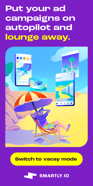
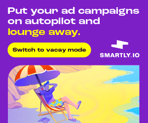
Hi @Nikki Gloudeman ! We are getting ready to launch our first Vertical campaign for Smartly.io focused on the Travel vertical (airlines, lodging, OTAs, cruises). Our landing page is still in development, but I'd love your feedback on these creatives. The concept is that with Smartly.io, marketers can put their campaigns on autopilot and take a well-earned vacay.

 1
1


Categories
- All Categories
- 20 Maturity Model
- 5 Groundwork Use Case Playbooks
- 7 Transform Use Case Playbooks
- 6 Maximize Use Case Playbooks
- 1 Roadmap
- 1 Crossword
- 734 All Discussions
- 55 Product Updates
- 61 6th Street
- 12 Welcome
- 4 Administrator Certification
- 3 Sales Certification
- 10 Advertising Certification
- 10 Demand Gen Plays
- 21 Reporting HQ
- Business Value Assessment (BVA)
- 38 AI Email
- 3 What is CE
- 8 Getting Started with CE
- 16 Thriving with CE
- 6 Conversation Starters
- 203 Job Board
- 34 General
- 11 Partner Place
- 200 Research Road
- Compensation Calculator
- 79 Sales
- 14 Pipeline Generation Tuesdays
- 20 BDR Block
- 11 SKO Supplies
- 7 Advice
- 2 Assets
- 20 Verticals
- 10 Manufacturing, Logistics & Supply Chain
- 8 Financial Services
- search-results
- 291 Events
- 12 6sense Quarterly Product Update (Recordings)
- 26 Customer Story Hour (Recordings)